Initial impressions from Figma Config 2024


There are about to be a flood of recap articles from Config 2024 — Figma's annual design and feature announcement conference. Before scrolling through the inevitable online discourse I thought I'd take a look at all the shiny new stuff for myself and jot down a few thoughts.
At the highest level we have:
- A big UI redesign
- A new Slides product / file type
- New task automation and generative design tools (AI)
- Enhancements to some of the existing core design and handoff tools
It seems like Figma are most focused on putting generative design tools at the forefront and on growing their user base with a new Slide design tool. I can see many things here that will enhance my day to day work. On the other hand, it does feel like this particular set of updates are skewed more toward design agencies and freelancers than to teams incrementally building product.
This focus I think is re-enforced by Dylan Field's own recap:
The last few decades of software have been marked by exponential growth. This trend is far from over. In a world where AI will be able to output fully-functioning interfaces from a simple prompt, design is more important than ever. In fact, design is what will differentiate great products from the obvious solutions, and Figma’s job is to help you explore the option space of possibilities. Today we’re launching many features to support that end-to-end process and unblock creativity so teams can bring their best ideas to life.
AI has been a contentious topic lately (for good reason). I have to say it's at least moderately encouraging to hear that the goal for these new tools has been toward helping people explore design possibilities and narrow down on solutions faster, rather than being touted as free thinking autonomous secret agent robots that will replace the need for all human creativity. As far as the stated design intent goes — it feels like the best possible outcome.
Overall, I really like the updates and there's definitely nothing in them that feels too unexpected.
The new UI
Having seen some of the early screenshots and being a little nervous, especially about a few details like a floating bottom toolbar replacing the old full width top toolbar, I have to say after using it for 24 hours that my nerves have been calmed — I'm a big fan. UI redesigns are really hard, and honestly I think Figma have been for most part nailing it every time. For a community of people who love to propose a redesign, we sure can be ironically allergic to having one handed down to us. Figma has a lot more features in it than it did in the early days, and I think we were due a refresh given that context. Almost everything about UI3 feels familiar but unobtrusive, generally meeting my muscle memory expectations and it's great having the vertical space back. The canvas feels more obviously extended beyond the tools, the new icons logical (though I wonder how these thin lines will render on low DPI screens).
I particularly like some of the finer aspects of the new UI, like the new file name placement with it's single click to rename (something which felt really clunky before) and the addition of a new Minimise UI option ⌘ + Shift + \ which still works in conjunction with the older Show/Hide UI ⌘ + \.
Crucially when the UI is in minimised mode, selecting something on the canvas brings back the properties panel. This is probably my absolute favourite thing about UI3 but it flew right over my head at first. It's a small but awesome detail which just feels really intuitive and saves me constantly toggling the UI on and off when wanting more space to work on a design.
The properties panel temporarily comes back when selecting something in minimised mode.
Something else cool is the new UI for an emerging concept of 'UI modes' (e.g. Dev Mode in Figma, Design Mode in Slides). It's a good demonstration of Figma growing their user base by building a Slides product with respect that people from different backgrounds will likely expect to approach the same underlying design tools in different ways.
There's even a new preference to show property labels for people new to Figma and struggling to understand what exactly everything is:
Overall really impressed.
As an aside, I find it wild how the team are currently designing, building and documenting 2 completely different interfaces:
That is a lot more work to do while there are still two interfaces in play!
Friction points
There are a few things in the new UI that are slowing me down. These are always a little different for everyone, and some I'm sure are just new muscle memory to learn — but a couple in particular I find a little more frustrating.
The biggest thing I miss from the old UI is the contextual affordance at the top middle of the old toolbar bar for things like creating and reseting components, using masks, and even Figma's new multi-edit modes.

All of that stuff has been moved to the top of the properties panel and some things are much more buried now now. For instance, the component reset button which I personally use a lot was before just a single click away — now it's a series of clicks and nested hover menus to do the exact same thing:
Contextual selection actions like component reset are now harder to reach.
⌘ + / or ⌘ + k (new UI only) and looking for "Use new UI (in beta)".I used these buttons constantly in my workflow before, so up the top felt really handy and helped me learn what the options were in my current selection state. I'd personally still prefer them to be housed in a floating toolbar at the top when something is selected. I can't help but feel like component library actions and vector drawing tools etc have all suffered a demotion to make way for new the AI tools.
Something else I miss from the old libraries UI was the sidebar navigation experience. Before, libraries were organised in a tree-like folder browser which allowed library designers to organise components into categories that reflected the framework they were based on and also allowed the designer to have any number of different folders open at once. I personally used this to have my most common component folders open for getting at them quickly.
This has been replaced with a more simple (and at times frustrating) forward and back navigation pattern, meaning many clicks back and forth in and out of folders to find the right components. On top of this, the new default view shows all components in one gigantic mega-folder, with sub folders being a preference in the library viewer settings.
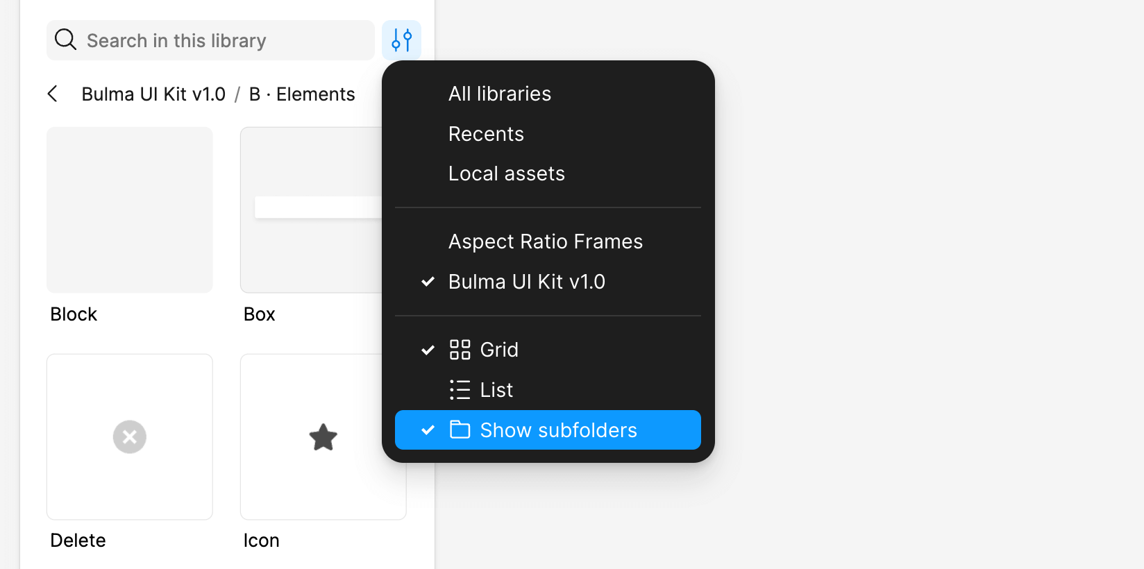
This feels weird from the perspective of how as a library designer do I organise the the components in the same way they are organised in their code documentation? Every design system I know of is organised into named sections — so I'm not too sure why enabling sub folders has been buried in a context menu like this. How are we supposed to organise libraries for people now knowing that most people will be seeing it without any of the structure?
Figma's sidebar documentation says that if the library has many components it will show in folder presentation even if 'Show subfolders' is unticked:
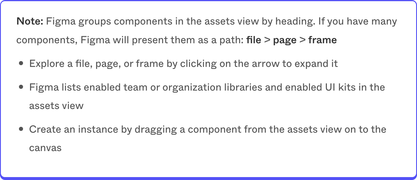
I can't figure out what constitutes 'many' components, and it also feels a bit weird to have a user preference setting be completely ignored in this way. I actually only discovered this after looking at some different libraries for a while, getting really confused about the different organisation presentations, deciding that this was either a bug or Figma's UI was gaslighting me — then stumbling on this note about what's really going on.
I'm a bit confused by all this. Component libraries were the killer feature that Figma nailed in comparison to the clunky system of Symbols in Sketch — it's a little baffling to me that the focus would shift away from encouraging library organisation at a time where it feels like these tools are table-stakes for a productive design team.
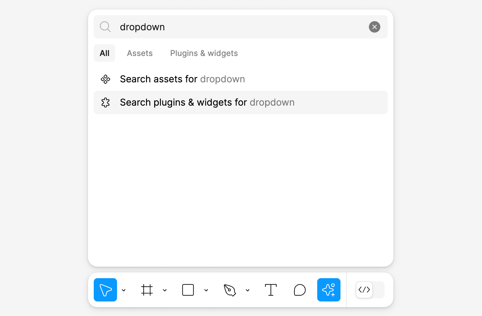
That all said, there are some cases where the opposite is true about libraries. Selecting a component instance now shows all of the variant properties at the very top of the design panel instead of under the design properties. The new assets search is smarter and can even be accessed by typing directly into the actions menu after pressing ⌘ + K:
There is also a new really clear empty sate in the assets tab teaching people that libraries can be connected to new files when none have been added yet. So perhaps this is just some stuff that will come out in the wash — we are looking at UI3 in limited beta after all!
Figma AI tools
I've been messing about with most of the new AI tools. I have to say that generally for the type of work I do, there isn't a strong use-case for them or I don't find them particularly groundbreaking yet.
The reason mostly boils down to the fact they're focused at such a high level. I understand to some degree this is on purpose — to generate a series of screens as possibilities for narrowing down on. But I just don't find this generally to be my problem. I spend much more of my time using component libraries to assemble screens and flows for new features in existing software, and this type of ideation just isn't the slowest part of my work. As it stands, the Make designs tool can't be prompted to use the specific component libraries that I need my designs to be drawn in. So even if I generate some concepts using the Make design tool — I still have to sit there and painfully translate all of it into library components by hand anyway. It's essentially like doing everything twice.
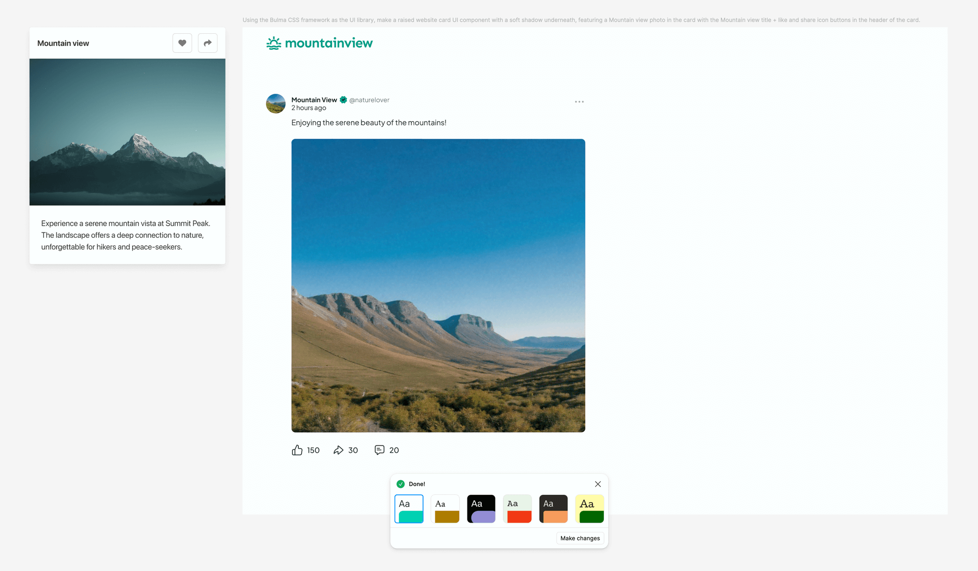
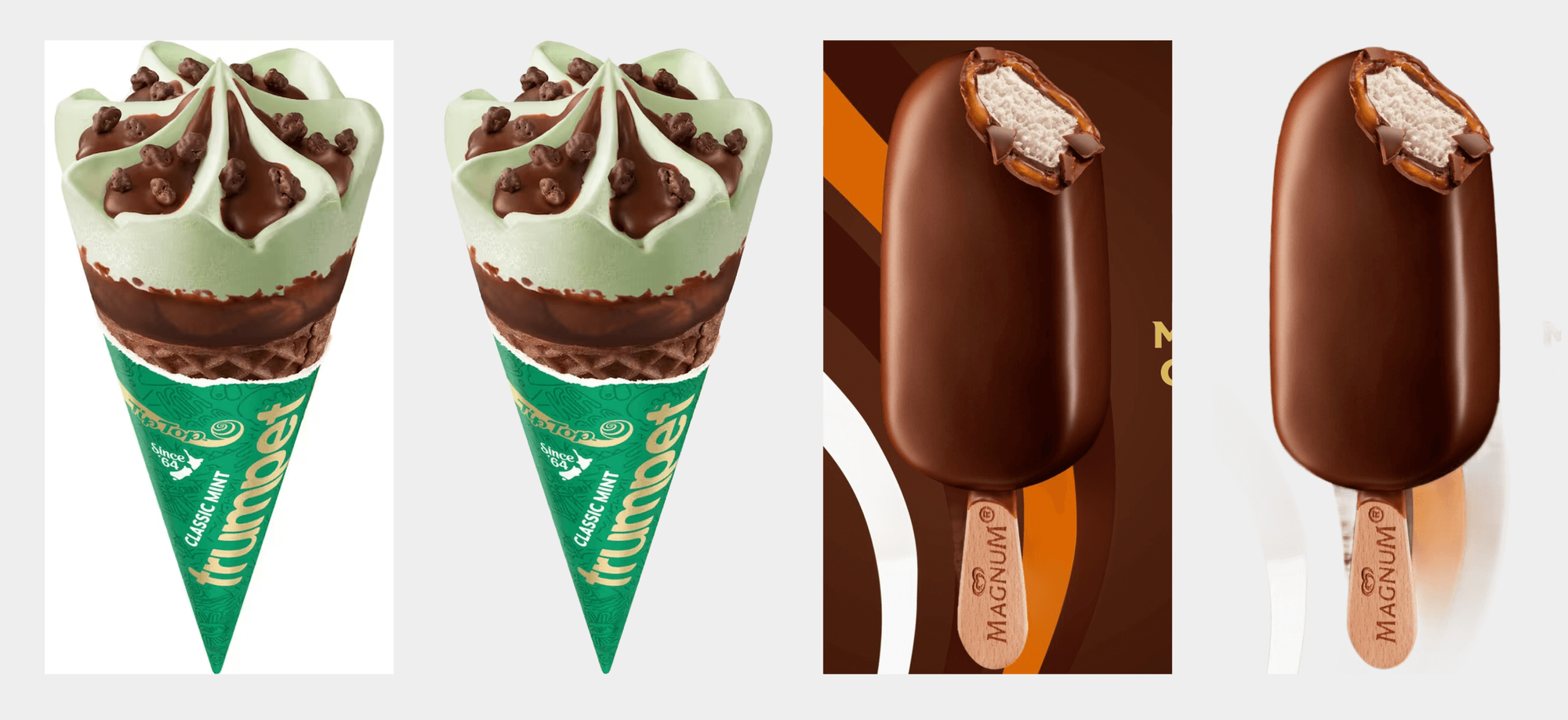
On top of that, Make designs right now only seems capable of drawing in 2 main styles 'Mobile app kit' and 'Website kit'. Neither are very flexible or capable of doing anything specific when prompted, like generating something even remotely similar to this Bulma UI Kit card component from earlier:
Some folks might tell me I need to become a better prompt engineer, but I'd argue that this implementation is just too limited right now. When it can make suggestions using my UI kit of choice then I'll be a lot more interested!
I imagine this could be different story for agencies or freelancers who work on new application and website designs from scratch more often. Generating whole concept flows quickly and then chopping parts of it around seems like a fast way to cobble an idea together in a similar way to cutting a wireframe together using screenshots.
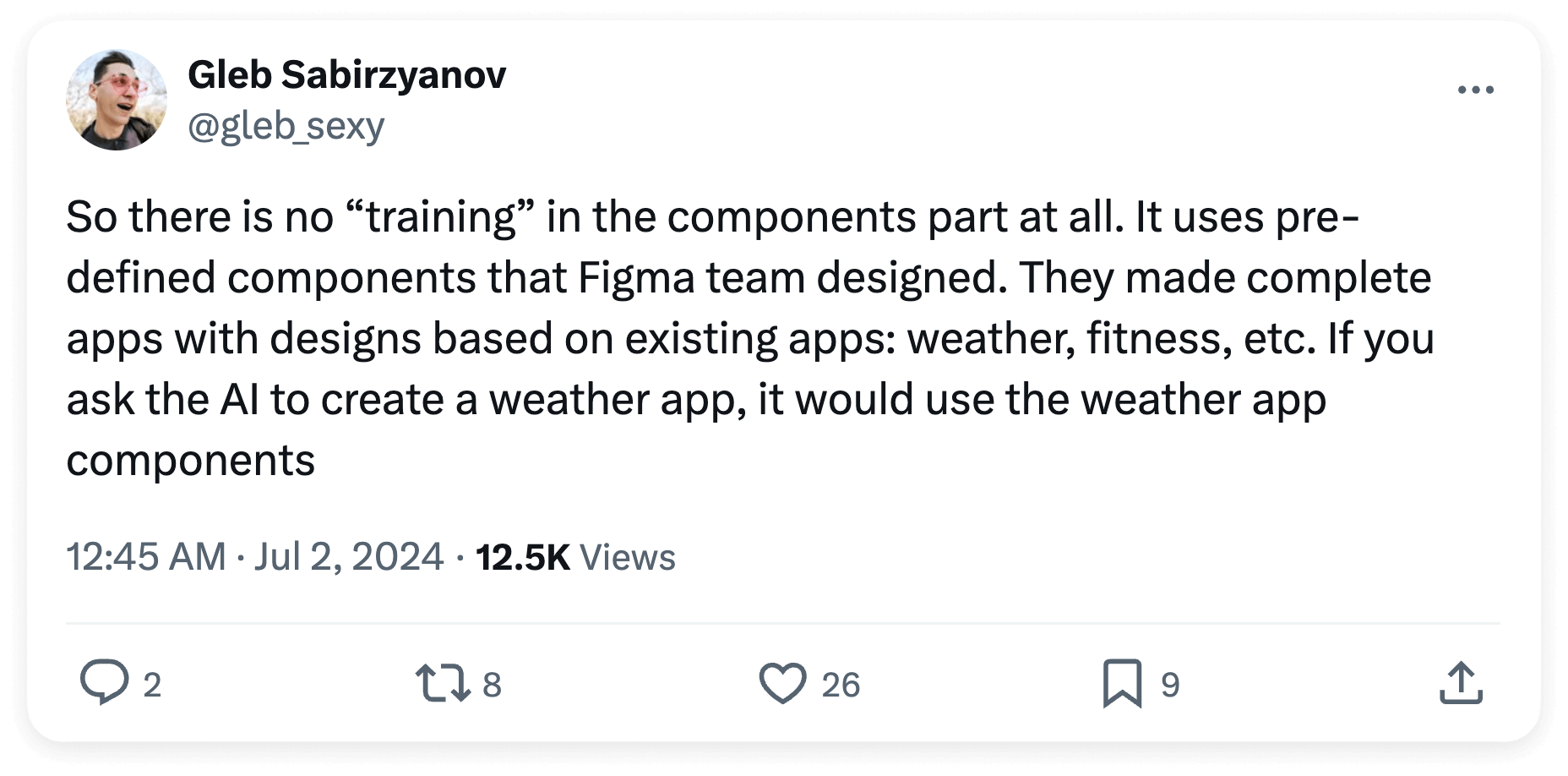
There has since been a bit of clarification from Figma about exactly why this was, I think best summed up by a few replies to the thread by Gleb which gave some insight into how the feature actually works:
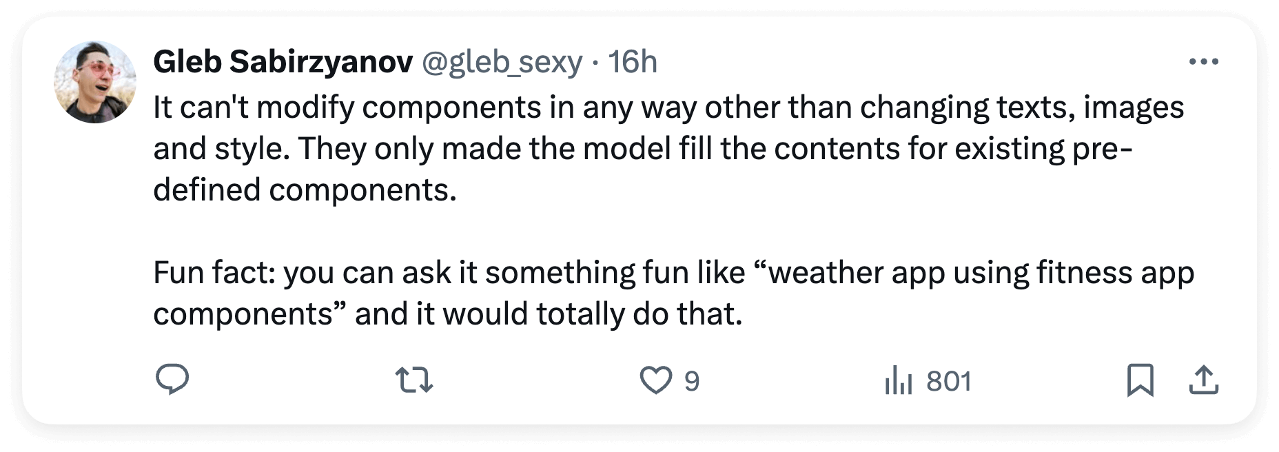
More recently, Figma also published a retrospective update further clarifying the specifics:

What this all essentially means is that Make designs is only capable of generating screens using these two hand-built component libraries made by the Figma team. Figma are however openly discussing how in the future this feature might work with our own component libraries — something I personally think might be the killer feature combination required to make real workflow gains.
An analogy I thought of to help describe this is that the OpenAI GPT model powering Make designs is taking your prompt and then picturing something based on all the apps and websites it has ever seen before. Then some other system is handed components from these two pre-built libraries as raw material to create a collage in the best possible likeness of that vision. This is probably a large part of the reason behind why at the moment most things produced by the feature appear extremely derivative apart from superficial styling you can apply afterwards.
Something I do really appreciate is the addition of a built-in background remover. I've used this numerous times already and it works well for removing white or otherwise plain backgrounds from things. It doesn't work as well in more challenging situations though and so sadly a round trip to Photoshop's subject selection tool is still going to be my go-to for a while.
On the topic of layer naming, I don't really care too much for it in my own process except when creating library files. I do still like things to be tidy though — so I'll probably give the Rename layers thing a go at some stage.
The new writing tools (Rewrite, Shorten, Replace content) are definitely nice things to have and I'll probably use them in some boring situations like filling out a bunch of example names in a list of repeated components etc. I've played around with them a bit and they definitely exhibit all of the usual weird and wonderfully frustrating behaviours of other LLM based tools, especially when it comes to revisions. Sometimes they do exactly what you want, other times ... they really don't.
If you don't really know what I'm talking about I'd suggest checking out Janelle Shane's article on the topic which really is a perfect summary of just how bad ChatGPT is at making revisions:
 Janelle Shane
In summary, I like that all these experiments are here. It's wild that simple prompts are generating editable designs. I'll definitely be messing around to see what more I can do with them, but right now they seem very difficult to guide and nothing feels like a real game-changer here yet.
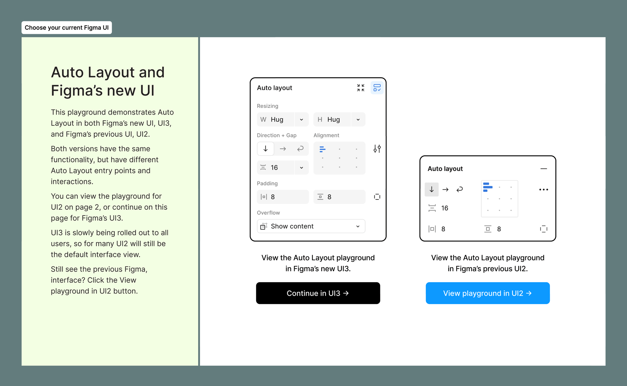
Auto layout and other changes
Some changes have been made to auto layout default behaviour to make it more intuitive. I have to say, these changes are so darn intuitive that without doing detailed forensics I barely notice them.
Items in auto layout now animate when re-ordering, and haptic feedback has been added to the trackpad so a tactile bump can be felt over the change threshold. Really nice touches.
There is a pretty cool new feature which allows auto layout to be added to a whole selection of nested layers at once, rather than having to go through and do it all by hand. I personally design in auto layout by default so this doesn't really occur to me as a process but I'm sure I'll find some use for it.
The prototype viewer has been made responsive 🎉.
I'm yet to take a good look at the Dev Mode changes, Make prototype tool, and the new Slides file type (but I'm quite excited about this last one).
Wishlist items
Here's a little list of other things my ideal Config would have included — I'm keen to hear yours!
- Library and component features integrated with the new AI tools.
- A new grid layout paradigm to go hand in hand with CSS grids.
- A way to set the aspect ratio of a frame so that images will work inside the new responsive prototype viewer without complicated fixed aspect ratio workarounds.
- Quality of life improvements to variables, in particular the ability to do simple calculations when assigning variables (set a variable to double another variable etc).