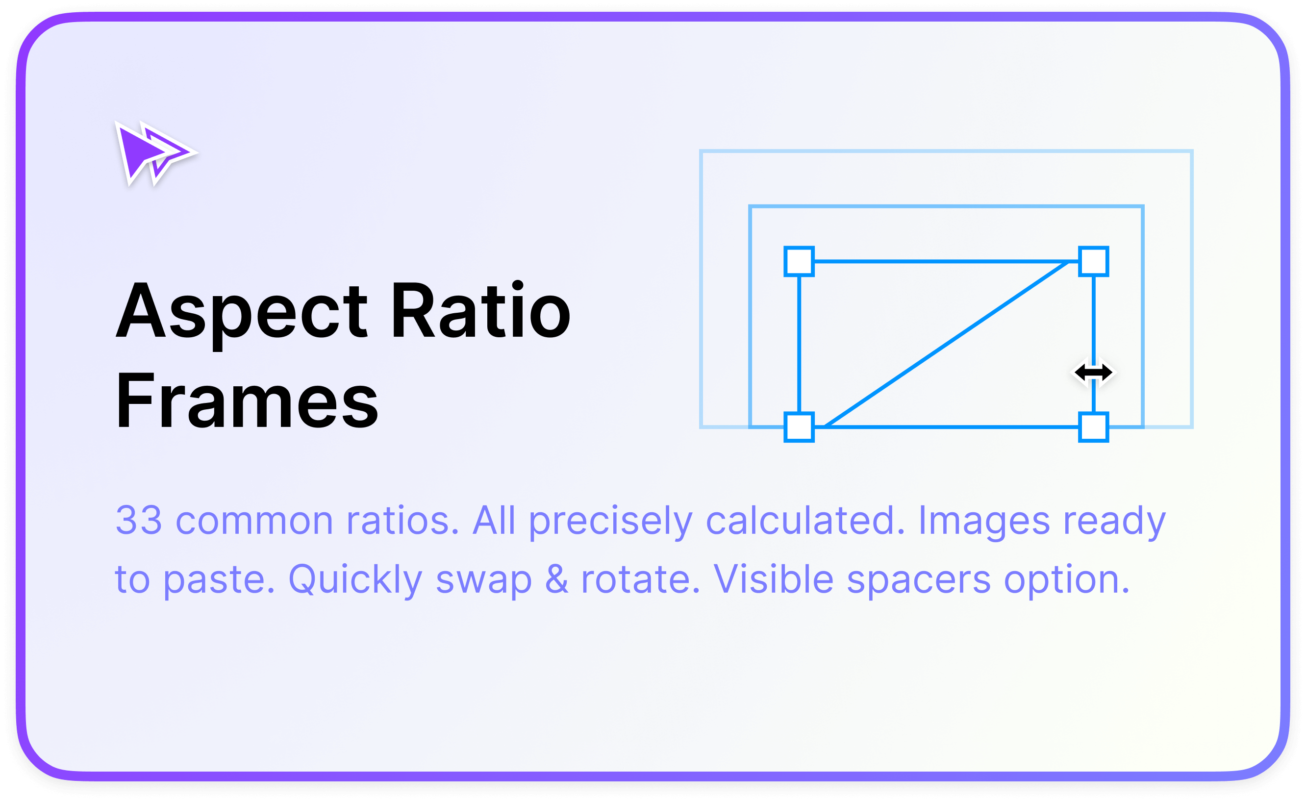
Fixed aspect ratios in Figma

I often find myself in the situation where I want an element in my design to maintain its aspect ratio inside a responsive layout. It's super common in the websites and apps we use every day — from images and videos to complex grids of elements all neatly maintaining their aspect ratios as they scale to fit our varying screens.
Since 2021 CSS has gained the dedicated property aspect-ratio for making elements with specific ratios easy to achieve. For years though web developers used a 'padded box' css trick to achieve the same result.
But Figma doesn't have it.
A handful of people have written about ways of making a frame stay in a fixed aspect ratio when resized and there are even a few plugins now which have implemented them — they really make creating responsive layouts a lot easier. Big kudos to the Figma community, and Solo Cube in particular for getting the ball rolling on this with techniques that I've used in many of my files 🙌.
One thing that had really been bugging me though is none of the methods I'd come across were perfect at producing any precise ratio and lacked clear reasons behind exactly why they work. This is very apparent when you try to create a new ratio from scratch. The process is very trail-and-error, involving many nested auto layout frames rotated at (seemingly) random magic angles — so I set out to see if there was an approach that was easier to explain.
The basic problem
There isn't any way to 'lock' the aspect ratio of a node in Figma. The design panel has a 'constrain proportions' button, but this doesn't actually do the thing we need here — those proportions are only constrained when setting element dimensions using the width and height fields in the design panel and they don't work inside a responsive auto layout frame either.
Proportions stay fixed by using the design panel, but break when resizing directly on the canvas, or inside an auto layout. Clunky.
The aspect ratio trick
I'm certain the team at Figma will address this eventually, but in the meantime there is an explainable trick we can use to make fixed aspect ratios work. It involves a little bit of trigonometry and exploits a small quirk about how elements behave inside auto layout frames.
The second example keeps everything in a 1:1 aspect ratio when the frame width is adjusted.
So how does this work? Firstly, let's mess about a little to understand some weird stuff about boxes in Figma.
Create a text layer and wrap it in an auto layout frame so that it makes a rectangular shape. Give it some padding and a background so you can easily see it. Wrap those in another auto layout frame then give that some padding as well as a different background colour.
Select the inner frame again and change the horizontal resizing property from ‘Hug’ to ‘Fill’. The outer container now hugs to fit the child and the child container fills to fit the hugging parent. Due to the text inside having an automatic width — the child container maintains a minimum size to fit the text content, and the parent container to responds to it as text is added. This is a classic Fill / Hug layout pattern used for creating all sorts of flexible layouts such as table columns that automatically resize to fit their widest cell.
Now rotate the purple box by just a few degrees. You’ll notice the outer frame grows vertically to fit the content (since the vertical resizing is set to hug).
The ratio of the outer frame changes as it's child is rotated.
This makes sense. How about when we rotate the purple box a little further? At 45 degrees something unusual seems to happen. The outer frame ‘snaps’ to be much narrower. What on earth is going on?
The outer frame snaps to fit the rotated child after a 45 degree rotation.
I believe what happens is that to start out with, the purple container's fill property is acting on the parent container in the horizontal axis — keeping the parent frame hugging to the child frame's intrinsic minimum size. However at 45 degrees, the angle of rotation makes the purple container's fill property go from ‘acting horizontally’ to ‘acting vertically’ in the eyes of the parent container. As far as the parent frame is concerned the child is now sideways — and it needs to hug to the child frame's vertical height now (but still in the horizontal canvas direction). Rotate it back and forth a bunch of times and you can see this behaviour threshold in action.
Note that no properties in the design are actually changed. The automatic layout forces of the outer frame are just applying as they should in response to the nested frame's orientation.
It's this mechanic that forms the basis of the aspect ratio trick. To demonstrate, let's make some modifications.
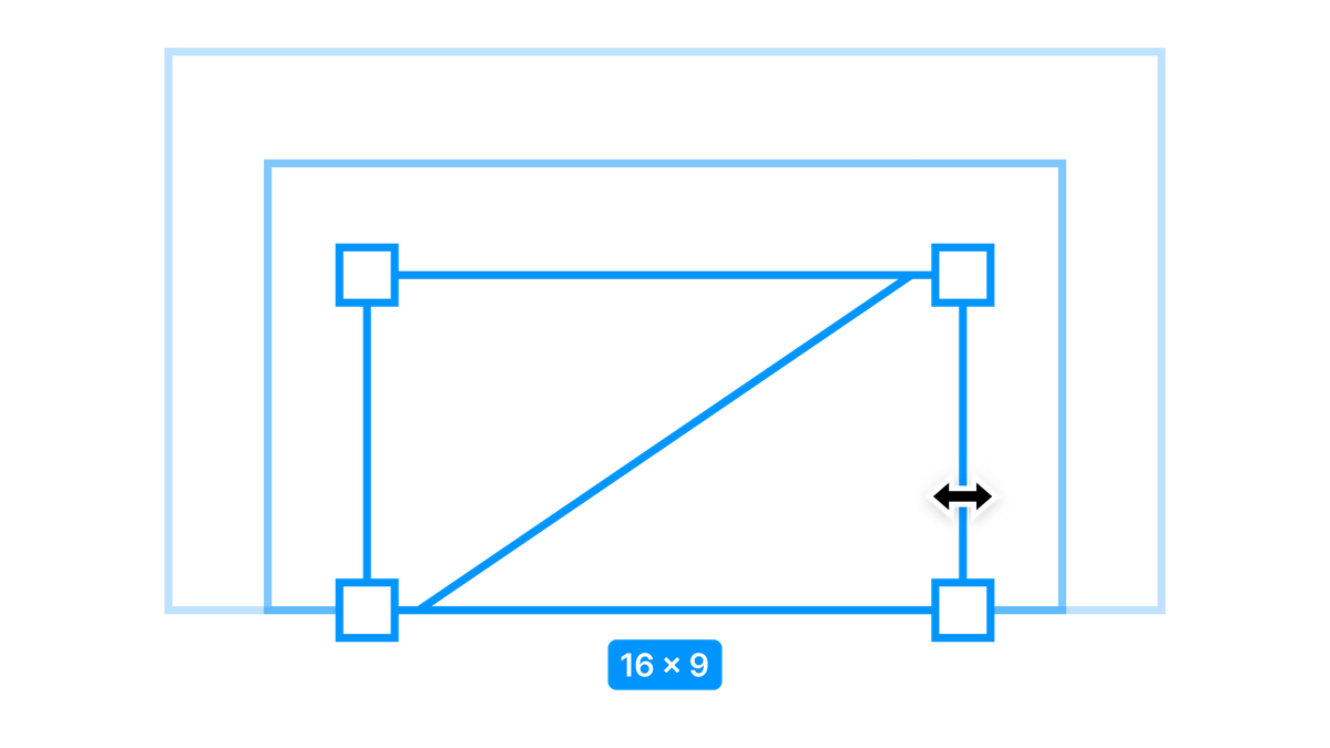
Change the outer frame width to fixed, remove the padding from both frames and then delete the text layer. Set the height of the inner frame to 0. We now have an invisible ratio spacer. Add a 1px outside stroke to the ratio spacer just so that we can see it temporarily and then start to rotate it — the outer frame will appear again.
Using the spacer angle determines an aspect ratio.
Now go ahead and adjust the outer frame width — the box resizes and keeps in the same aspect ratio!
📐 Taking things further
If you were happy with a rough estimated ratio we could just remove the inner frame border and stop right there. But we can be a little smarter. What is the relationship between the angle of the inner frame and the height of the outer frame? Our design sure is looking a lot like a triangle now...
Ratios are expressed as Numerator : Denominator and the angle of a triangle can be found using sin(θ) = Opposite / Hypotenuse.
Let's take a common ratio like 16:9.
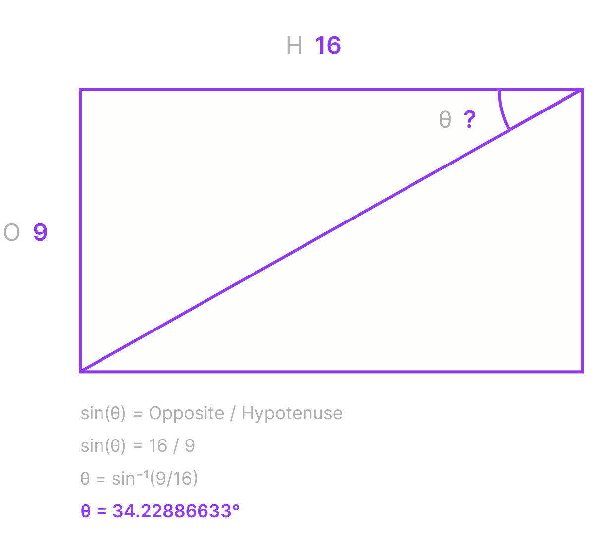
We can use an Inverse Sin equation to make this really easy:
arcsin(Denominator/Numerator)
So for our 16:9 example here is the equation:
arcsin(9/16) = 34.22886633
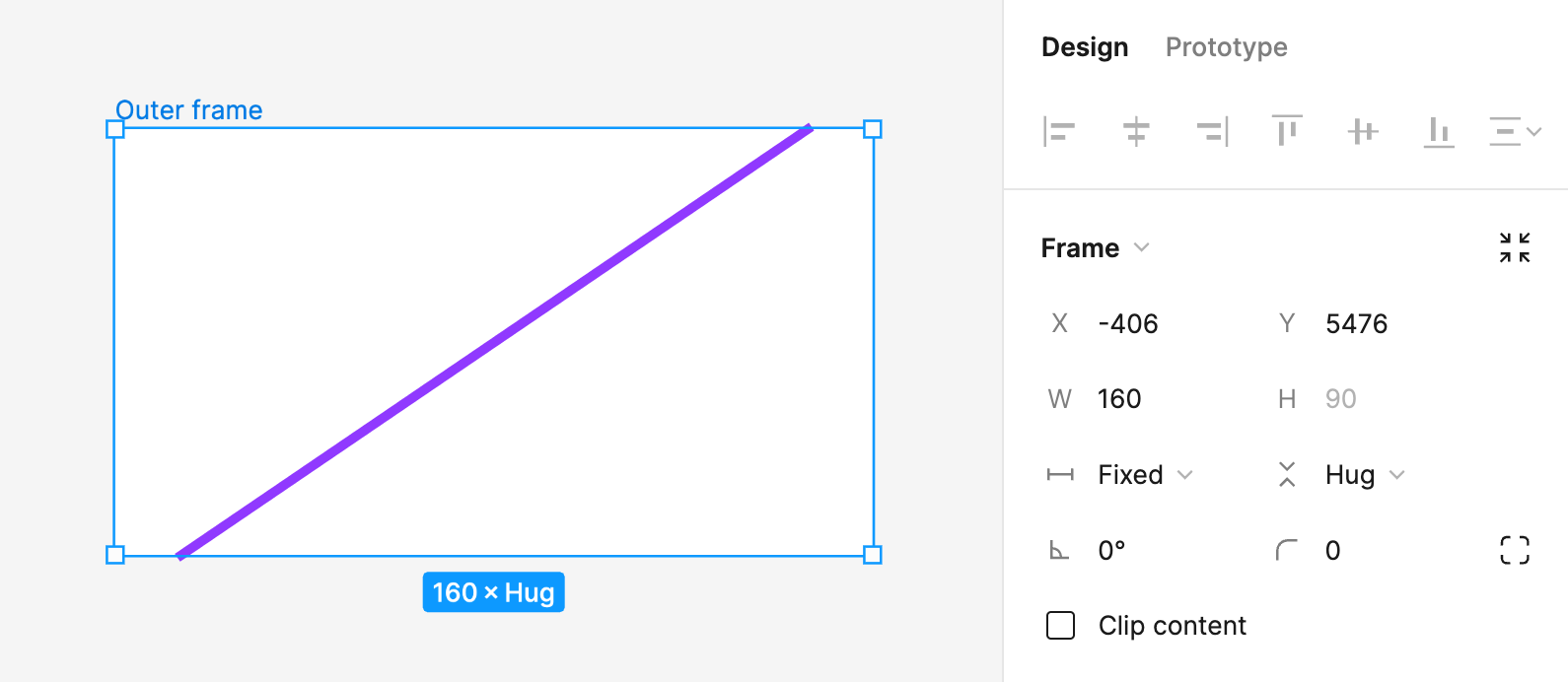
Set the purple frame rotation to 34.22886633°, the outer frame width to 160 then watch the height change to be exactly 90 — a perfect aspect ratio! 🎉
But hold off on the celebration, a Sin equation won't work for all angles as the Opposite and Hypotenuse move around for different triangles. In theory we could use the other trigonometric functions to calculate angles for different ratios — but there's a small problem. Remember that 45 degree threshold from before? Try increasing the angle beyond 45 degrees now.
At 45 degrees the spacer breaks.
A random square appears 🧐 and the aspect ratio magic is broken.
What we're seeing here is actually the same thing as before, only now the parent frame has it's width set to a fixed value, rather than hug like it was originally. This means it can't just shrink to fit the line because we've told it exactly how wide to be. The only thing left to happen is for that inner frame to fill the available space in the horizontal direction, and if you look closely you can actually see the height value get forced from 0 to 160 which is why it doesn't shrink when you rotate it back again. I'm actually unsure if this is a bug in Figma or intended as an edge-case behaviour, but either way we need to work around it.
Previously, folks have attempted to solve this 'break point' problem by nesting many frames inside each other at various angles and making them have fill properties in both directions. This is the part that makes figuring out the angle of rotation either really hard or impossible (and not very precise) so I came up with an alternative.
A method for all ratios
To get around our 45 degree limitation we can simply use more ratio spacers. Divide the height component of the aspect ratio into smaller parts that result in an angle below 45 degrees — then stack them all on top of each other. As an added bonus arcsin(Denominator/Numerator) is now the only bit of trigonometry that we need.
Let's try this with a square. We know that the ratio spacer for a 1:1 ratio is going to be a straight up and down line equal to the width of the square, or arcsin(1/1) resulting in an angle of 90 degrees. 90 degrees is too big for our 45 degree limit so we know we can't make it using a single ratio spacer.
arcsin(1) in degrees.Instead, imagine two half boxes stacked on top of each other by dividing the denominator (the second number) in two. Our ratio is now 1:0.5 or 2:1.
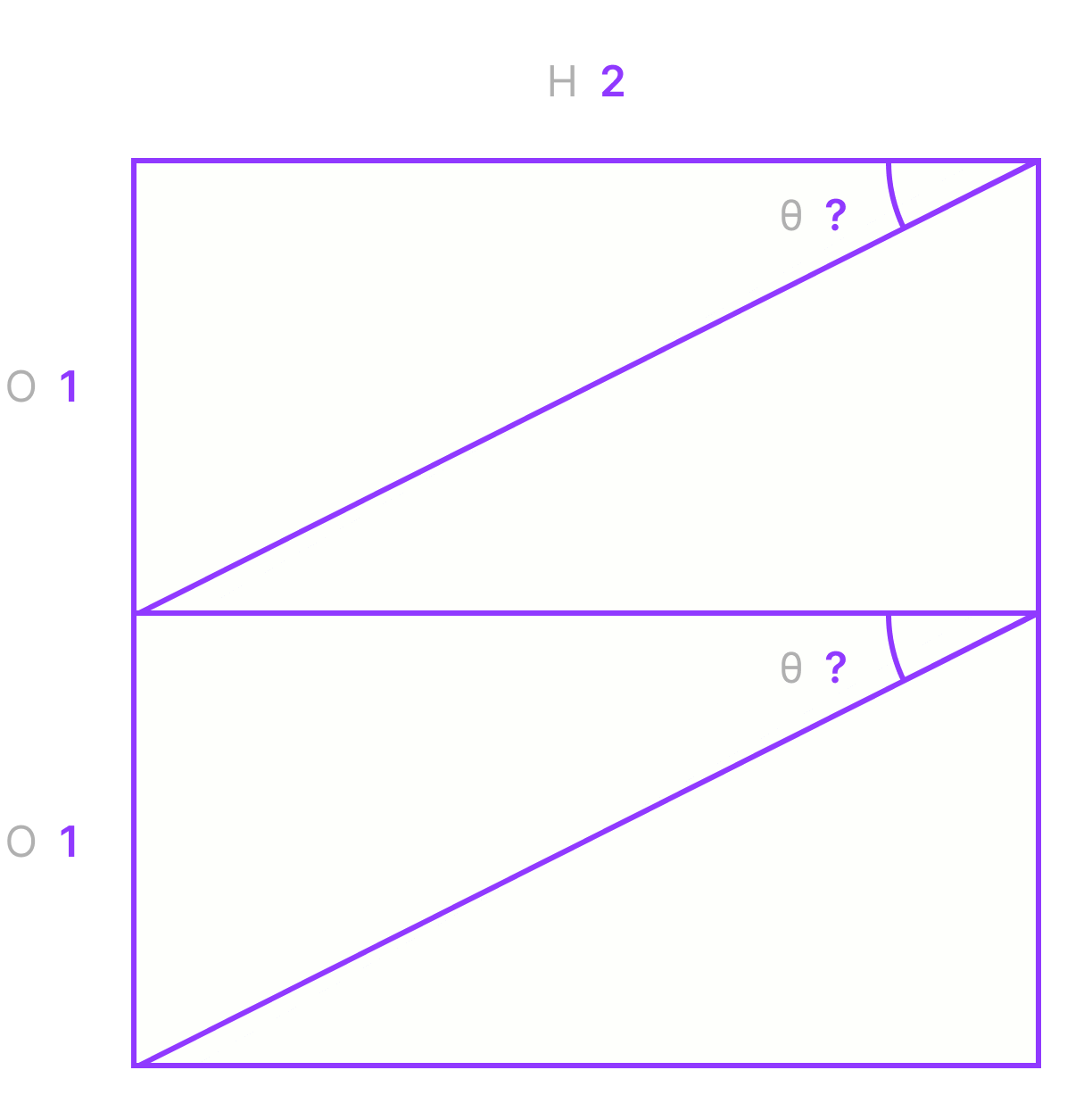
Now let's try that equation again: arcsin(1/2) = 30
Make sure the outer frame auto layout orientation property is set to vertical, set the ratio spacer to 30 degrees and then duplicate it — a perfect square! 🎉
The results
Using this technique any ratio at all can be solved without any complicated guesswork, and the implementation in Figma is a simple case of adding more spacers to the existing container. To save you the trouble, I've typed up a set of the most common ratios. Using the API to inspect the file it seems that Figma keeps around 6 decimal places of precision internally (even though the UI only shows 2) — so I've personally opted to enter these numbers in full.
| Ratio | Spacer | Spacer angle | Count |
|---|---|---|---|
| 1:1 | 2:1 | 30° | 2x |
| 9:8 | 9:4 | 26.3878° | 2x |
| 8:9 | 16:9 | 34.2288663° | 2x |
| 7:6 | 7:3 | 25.3769335° | 2x |
| 6:7 | 12:7 | 35.6853347° | 2x |
| 5:4 | 5:2 | 23.5781785° | 2x |
| 4:5 | 8:5 | 38.6821875° | 2x |
| 4:3 | 8:3 | 22.0243128° | 2x |
| 3:4 | 3:2 | 41.8103149° | 2x |
| 7:5 | 14:5 | 20.9248324° | 2x |
| 5:7 | 10:7 | 44.427004° | 2x |
| 3:2 | - | 41.8103149° | 1x |
| 2:3 | 2:1 | 30° | 3x |
| 8:5 | - | 38.6821875° | 1x |
| 5:8 | 5:2 | 23.5781785° | 4x |
| 1.618:1 | - | 38.1736538° | 1x |
| 1:1.618 | 4:1.618 | 23.8597984° | 4x |
| 5:3 | - | 36.8698976° | 1x |
| 3:5 | 12:5 | 24.6243184° | 4x |
| 16:9 | - | 34.2288663° | 1x |
| 9:16 | 9:4 | 26.3878° | 4x |
| 2:1 | - | 30° | 1x |
| 1:2 | 4:2 | 30° | 4x |
| 21:9 | - | 25.3769335° | 1x |
| 9:21 | 36:21 | 35.6853347° | 4x |
| 5:2 | - | 23.5781785° | 1x |
| 2:5 | 8:5 | 38.6821875° | 4x |
| 8:3 | - | 22.0243128° | 1x |
| 3:8 | 3:2 | 41.8103149° | 4x |
| 3:1 | - | 19.4712206° | 1x |
| 1:3 | 5:3 | 36.8698976° | 5x |
| 4:1 | - | 14.4775122° | 1x |
| 1:4 | 8:4 | 30° | 8x |
A fully responsive masonry grid of images, all using different aspect ratios.
A set of these components are also ready to go on the Figma community:
Beyond library files
Reading through source code for a few of the community plugins available, I noticed some of them contained quite a few edge case conditions for handling particular ratios, and in some situations they worked by brute-force — a guess-and-check style technique having Figma render various nested boxes, wiggling their rotations and then checking the resulting dimensions over and over again until they were approximately correct.
However I think using this ratio spacer technique we should be able to create a simple and precise Figma plugin because the exact same process is used for every input.
I'm holding off on this because as I said I'm confident Figma will eventually land with a feature making all of this redundant, especially given there is native support in CSS for this now. But I also wanted to share in particular some of the more spooky inner workings of auto layout frames in conjunction with rotation and resizing properties in Figma — I think they're interesting and a lot can be achieved by understanding them better.
Enjoyed this read? If you're able, small tips and donations are greatly appreciated — they help me to write more in-depth articles like these.