Isometric illustration in Figma
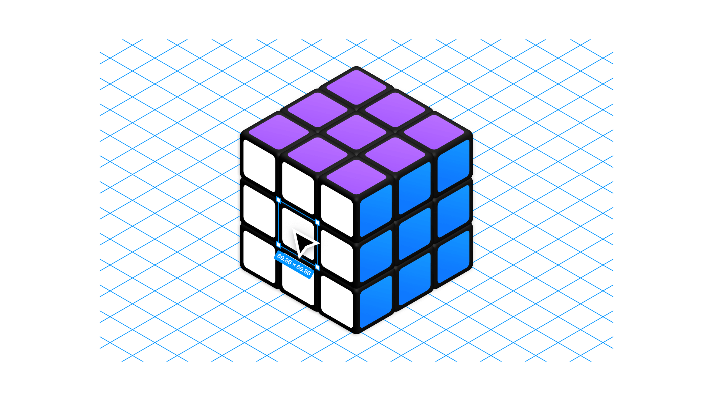
I often feel like illustration is an under served niche in Figma's toolset, despite having an exceptional foundation for vector drawing.
If you haven't read Evan Wallace's blog post from back in 2016 on the Vector Networks implementation in Figma, I recommend giving it a read as it's a short but succinct explanation for why I think the vector tools feel so good to use.
It's obvious that these features are just the basics done well, but this hasn't stopped people from doing a lot of neat stuff with them — and one of those things is drawing in isometric perspective.
Figma has a really interesting... hack? Feature? I'm not 100% sure why this trick exists, or how it works the way that it does but it makes creating isometric illustrations really easy.
First, a quick overview of what isometric projection actually is.
Put simply, it is a very simple way of representing a 3D object in 2D. The reason for the simplicity compared to other graphical projections is that the scale along each of the 3 axis (X,Y,Z) is the same, and horizontal lines run parallel to each other with no vanishing point. It is a very tidy grid.
Let's look at an example:
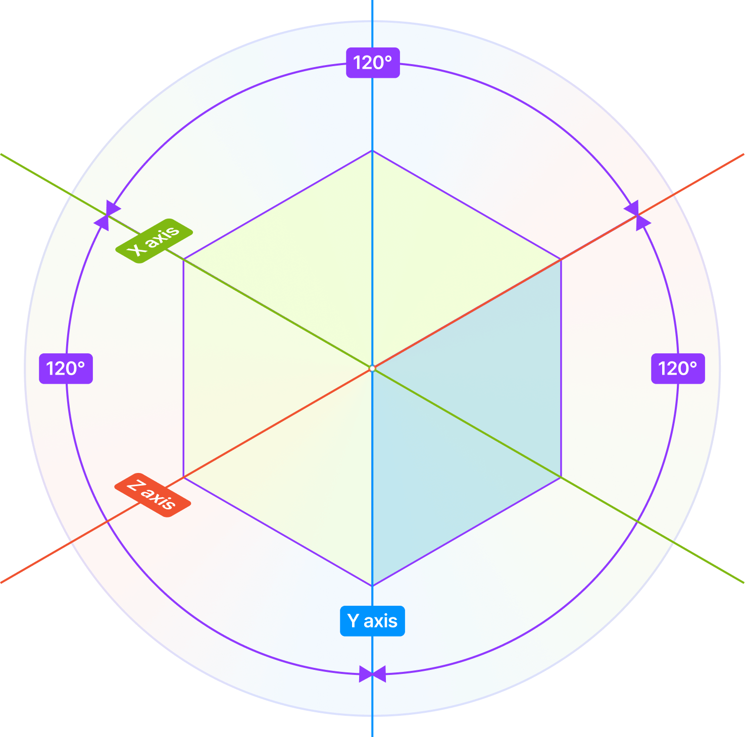
Here we have a cube represented in Isometric perspective. Just looks like a hexagon right? Note that the 2 dimensional angle (or how we draw it) between any two of the 3 dimensional axis (or how we see it) is always 120 degrees.
Rotating shapes 30, 60 or 120 degrees is easy enough in terms of getting things to line up along the grid, but you can see that each face is also 'skewed' by 30 degrees:
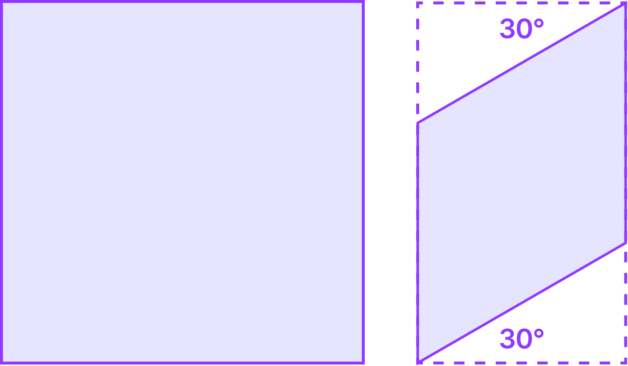
You could just draw a grid, and start drawing directly on top of it, freehand. But what if there was some way to skew objects into the perspective needed to get things slotting neatly together?
This is where our Figma trick comes in.
Make yourself a large grid of evenly spaced lines rotated 30° and -30°.
Alternatively download this set of PNG assets grid lines and use them as tiled background image to create your guides:
Now draw a square. Rotate the square to 45° (this step is essentially turning the cube so that one of it's edges is directly facing us).
Now the magic part — group or frame this rotated square. Something interesting happens. Rather than the selection box and resize handles being rotated 45 degrees like before, a new origin is established for the group in the standard canvas orientation and the selection box is drawn as a new square around shape.
Now resize the whole thing vertically to 'skew' it until the lines start lining up parallel with your grid guides. From here you can ungroup and duplicate the skewed box, rotate it 60° to make the sides, duplicate again and flip horizontally to make the other sides — and just slide everything into place. This isn't very accurate, but it works with the grid lines to follow:
Grouping a rotated shape before adjusting the height allows you to 'skew' it into isometric perspective before ungrouping it again.
The cool thing about all this is that after the shapes have been ungrouped, you'll notice that the selection reticle and resize handles are back to fitting the shapes with their own rotated origin — only now you can resize them in isometric perspective:
Shapes can now be freely moved around and resized along their isometric axis.
It's the last detail that I find really wild about how Figma handles this scenario. No matter how much reading I do on the topic I still haven't found any confirmation as to whether this is an intentional feature, an unintended side effect, bug or something else (do drop a comment if you have the answer!).
This is the basis of the isometric technique. Draw. Rotate 45°. Skew. Rotate back 60°. Different rotation directions produce different 'sides'.
Everything just works here, for example changing shape border radius is skewed as you would expect.
One technique I've used a lot is drawing designs flat as components, then instancing them before doing the skew process so that the design can changed by tweaking the flat version — updating automatically in the isometric perspective. Super helpful for things like product mocks inside isometric device frames etc.
.5773 rather than adjusting it by hand.There are a stack of plugins that use these techniques and allow the toggling between different side projections:
I could go into quite a lot of detail about all the steps and techniques for different aspects of a drawing, but I really feel the best approach is to start doing it yourself — once you get a feel for the way the underlying isometric grid works then everything just falls into place.
However I think it helps to see some examples. What can sort of stuff can you do with this?
Here's a file I made for building an auto layout Rubik's Cube:
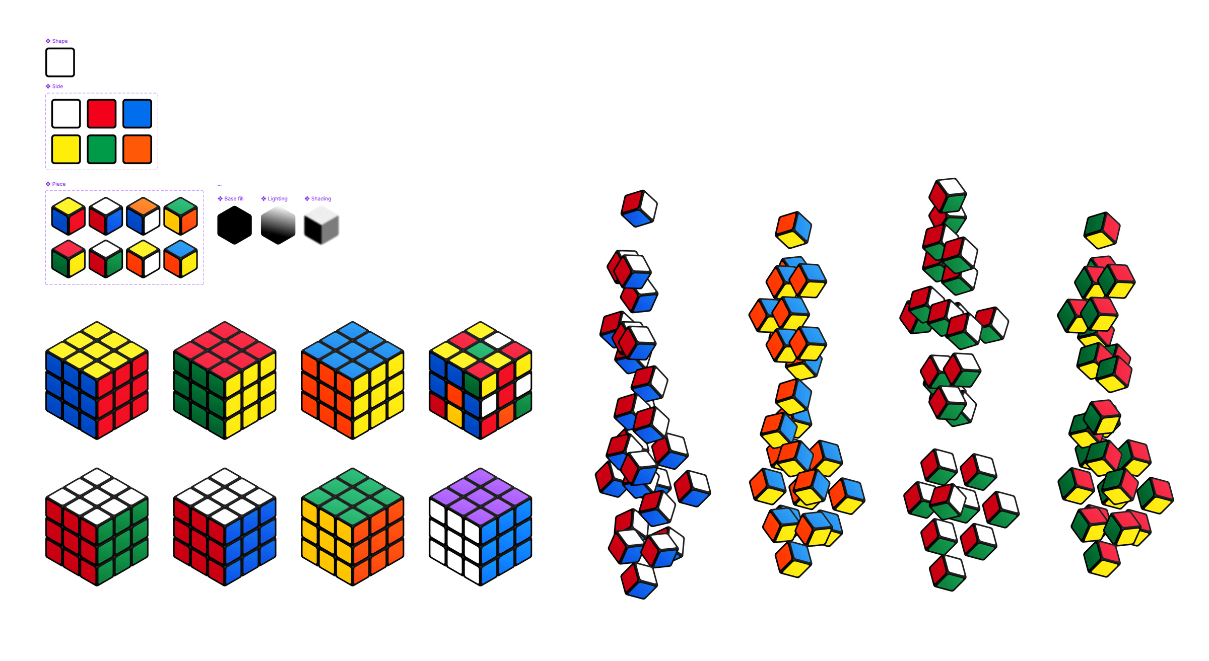
The file is made up of a single flat piece 'side' design. That is nested inside another multi-variant component to create 6 side colours. Those are then assembled into the 8 different piece types needed to make any cube, with a series of lighting and shading layers added to give them depth. Then those is assembled into a series of auto layout rows all stacked on top of each other to create each cube.
Piece variants can be swapped to make any cube design, plus gaps and rotations can be added to generate interesting layouts and patterns.
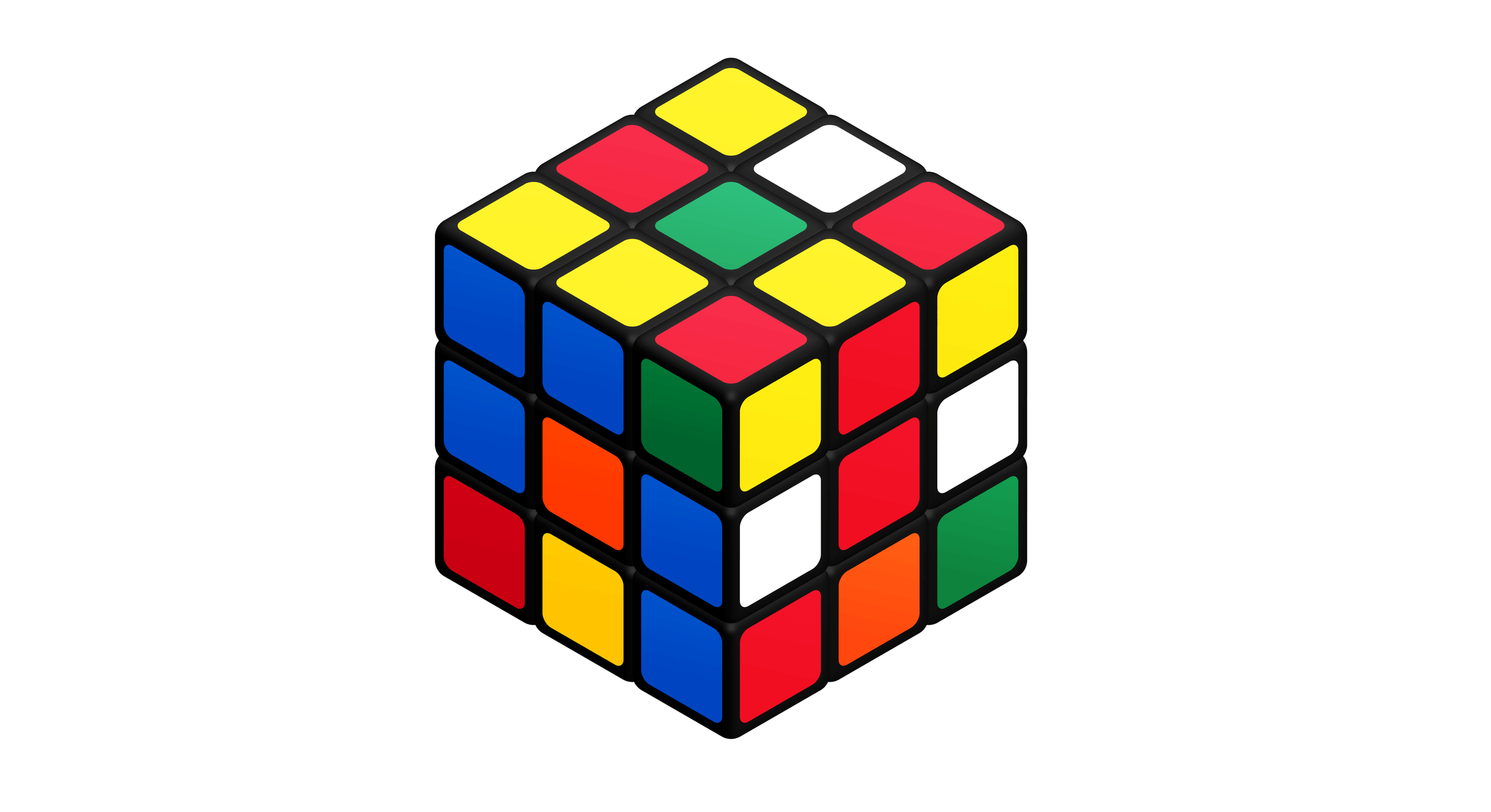
These can be easily animated using smart animate for fun. Thanks to my friend and old colleague Diego for making this suggestion! Note these are best viewed on desktop.
There is no 'depth' in isometric perspective — which means you can build interesting optical illusions and impossible shapes:
Not everything has to be a square either. I've enjoyed using components in illustrations for breaking things down into smaller patterns and elements:
Using dynamic flat components as skewed layers layers in a ramen bowl illustration.
There's something about these simple yet powerful drawing tools that I just really love using — hopefully this has inspired you to have a go too!
Who knows maybe one day we'll see a dedicated illustration file type from Figma expanding on them to compete with Adobe etc in the Illustration space.
Found something helpful here? If you're able, small tips and donations help me find more neat tricks like this to write about.


