The negative margin hack

I was messing around with Figma variables recently when by accident I came across a trick that allows the use of negative values for auto layout padding.
Of course I'm not the first to discover this workaround but it surprised me — it's a little unclear whether this behaviour is intentional exactly in the way that it works given that CSS only supports negative values for margins (not padding). However Figma seem to have signalled that official support for negative margins is at least somewhere on their radar, so perhaps it was a restriction they softened when support for variables launched as a way to lighten the number of edge-case validations that would need to be handled.
Either way I think it's quite a cool interim workaround which could be used in special situations similar to how negative margin techniques are used in CSS.
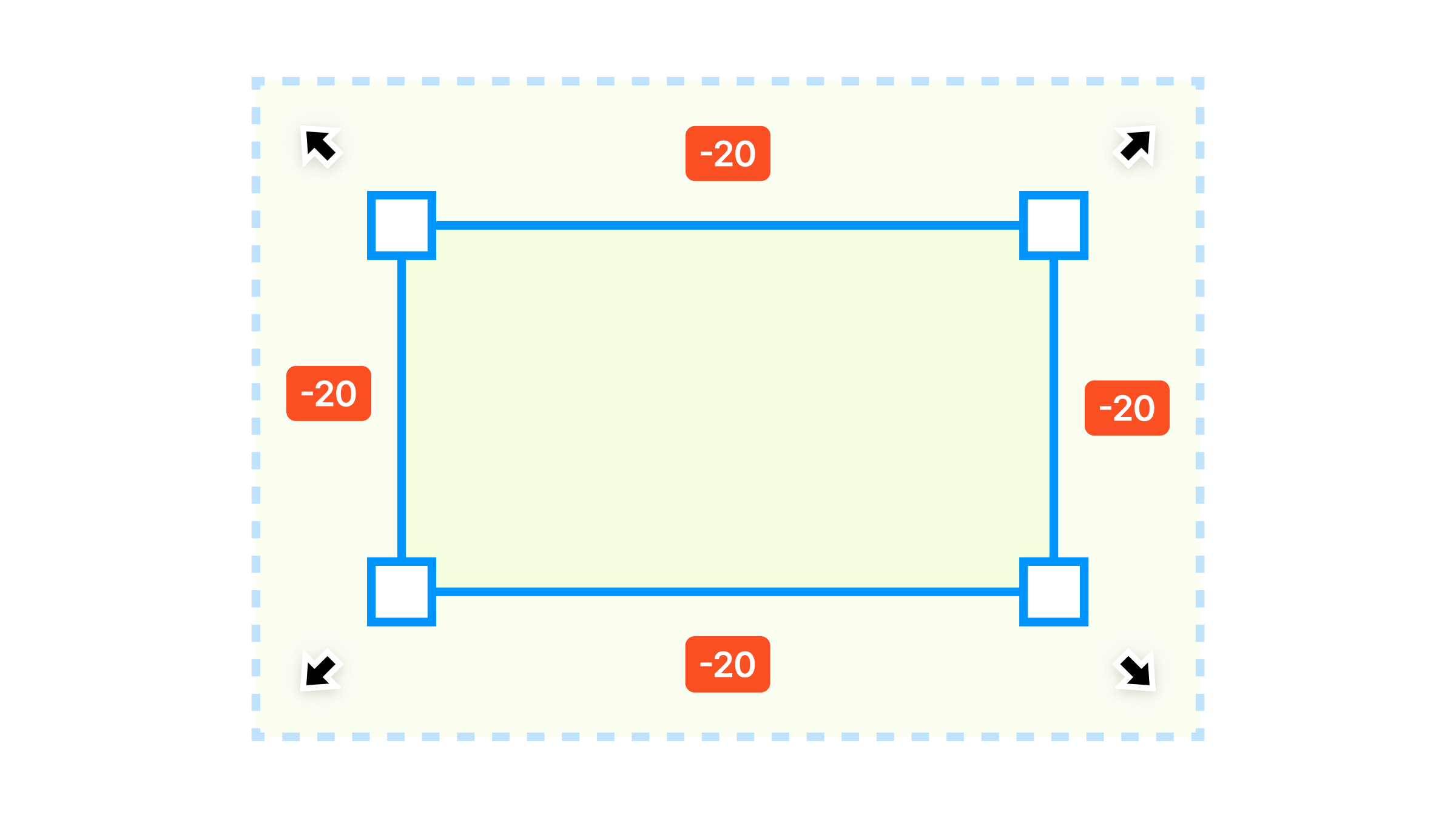
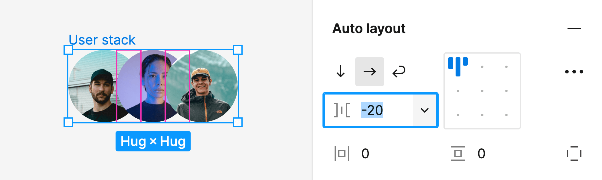
It's already possible to enter negative values for the auto layout gap property, useful for many types of overlapping stack patterns like user profile stacks — but the padding property resets any negative value entry back to 0.
However, if you connect a padding property to a variable it's then possible to set the variable to a negative value. This makes it possible to achieve a similar outcome by setting the child element padding values to negative numbers.
Probably use this with caution but I think it's helpful in situations where you would need to create many more padding containers to achieve your spacing goals such as with dividers, images or headers that span the full width of their padded cards.
Here's an example implementing a Shoelace card since I've been working with this library a lot recently:
Implementing negative margins by setting the image padding values to a variable.
Basically you need to configure two variables, one for the card padding and another inverted value to pull the image back over the card padding space. Assign padding to the card and the negative margin value to the top, left and right padding properties on the image container. Now the images can live at the same level as the other card content and still cover the card's padding space, rather than having to move the padding values into extra containers.
I've created a component with a variant for the negative margin so that the image layout can be toggled between the two options rather than having to fiddle around with the element nesting structure to try on different looks.
This works inside other auto layouts too in all the responsive ways you would expect (in the example I've included responsive image components built using the fixed aspect ratio trick).